Migrating from Jekyll to Hexo - New blog site

My Blog v1

I have the domain aoliu.dev from Google Domian for a long time, which hosted my v1 blog using Jekyll. I created my first blog during the time I was finishing my master degree. I forked one of the templates repository and spent two nights trying to understand how Jekyll works. I don’t have any knowledge of HTML, CSS and Javascript at that time. So everthing was simple. You wrote your content as markdown, you committed to the website repository, Github automatically deployed it in several seconds.

No analytics, no formal QA procedure. Just a simple portfolio website.(You can still find it at here)

The website was kind of forgotton till it comes to the time when Google sent me my domain name renewal recipt.

“Wait, I got a blog website?”

Maybe there is a chance I could give it a better look.

Jerkll to Hexo

Then I found Hexo, which catches my eye with its abendent extension support with npm. Hexo also comes with a better community and a simple CLI deployment commend. Other than that, it shares a similar component like Jerkll. You can config your blog using yaml and write your blog using markdown with the support of code highlighting.

Building blog with confident

What is even better is Vercel. Once Hexo pushes to my staging branch on Github, Vercel will automatically pulls the branch and deploy it to my demo domain. After I’m satisfied with my changes, I’ll submit a PR to the master branch which will be deployed to the production environment.

Vercel guarantees the speed with their global CDNs and provides a HTTPS connection by default, all included within their free plan.

Time spent on migration

Similarly, it took me two nights to move my contents to my new blog. But now with some basic knowledge of web development, it was much easier for me to make some modifications to the template I got.

Blog Roadmap

It might sound funny to have a blog roadmap. Started as a place for data analytics, my plan is to expand its scope later on, where I can also wrote about trying new tech stacks, like Kubernetes. I’m also impressed by the power of Vercel, where you can build your serverless API and JS apps. There are always a lot of staff to explore!

But for now, I’ll call it a post and try to fix some dead pic url from my old blog. Stay tune!

Advertisement Competition between top 3 Fast Food Chains -Tableau Vizulization and Analysis

IsIygJ

Data visulizaiton would always be fun if you have some interesting data. For this one, I got this data from parts of the take home challenge. This is what I made in two hours. Here is the Tableau Dashboard.

Data Introduction

According to QSR 50 , McDonald’s, Burger King and Wendy’s are ranked as the top three fast food chains in the US.

-Data Source:

Alphonso Airings Report for McDonald’s, Burger King and Wendy’s, collected between Jan 1st, 2018 and Apr 6th, 2018

-Dimensions:

Advertisement Content: Title, Brand, Product, Category

Network: Network Name, Network Type, Show, Pod Position

Time: Date and time, Time Zone, length, EQ Units

Exploratory Analysis - Content

McDonald’s:Aired on 62 Networks with 1,796 Shows

Most Aired Advertisement:
“McDonald‘s ”I’m Lovin‘ It“ TV Commercial” with 2,890 EQ units

Burger King: Aired on 89 Networks with 2,962 Shows

Most Aired Advertisement:
“Burger King Whopper And Crispy Chicken 2 For $ 6 Mix Or Match Your Way“ TV Commercial” with 10,331 EQ units

Wendy’s: Aired on 70 Networks on 2,090 Shows

Most Aired Advertisement:
Wendy‘s 4 For $ 4 Quality Is Our Recipe TV Commercial with 5,037 EQ units

Exploratory Analysis - Network

All three companies prefer putting their ad on Sports Related Events, especially for Wendy’s, who focuses more on Baseball and Basketball.
McDonald’s and Burger King also put considerable resources on entertainment channels.

Exploratory Analysis - Time

For the time of the day, Wendy’s focuses more on Daytime part, while Burger king puts their ads more evenly between Prime Time and Daytime for higher audience coverage. Both three chains put more resources for weekends, but Burger King emphasis more on Sundays.

Competition Analysis

But how would they compete with each other on the limited audience resources?

Data Preparation

To compare the brand on the same level, we took only the networks with the top 7 viewers, including CBS, NBC, ABC, Fox, Univision, USA and ESPN.

Measurements:

Competition Analysis – Across all channels

Sports

Sports Networks like ESPN is the main battle round for fast food chains, where Burger King takes higher voice during weekdays, but Wendy’s is bidding hard for weekend airing times, targeting Sports Live audiences

Network Preference

McDonald’s takes dominance in national networks including NBC, ABC, CBS and Fox, for wider audience reach, while Burger King dominates USA Network.

Weekend vs. Weekday

For national networks, Wendy’s strategy is that it puts their most resources bidding for airing times for weekends, where there is higher possibilities that target audience would watch television. It even gives up some of the network for some day.
We also saw some huge drops for McDonald’s during weekends.

Competition Analysis – Day Parts at ESPN & CBS

We would compare brands detailed airtime strategy between two different types of networks, we took ESPN and CBS as the example.

ESPN

Insight:

Wendy‘s loves weekends. It puts most their expense and took the dominance for Day Time and Early Fringe during weekends, where the weight could be as high as 76%. They also took much advantage of Weekend Prime Time.

Burger King bids more for Over night and Early morning for weekdays and weekends, while McDonald’s voice is weight is relatively stable.

CBS

Insight:

When it comes to non-sporting networks, Wendy’s weight is much lower, it gives up over 50% of the day parts, but still it invest money into Weekend Daytime, and took dominance at Sunday on Early Fringe.

McDonald’s takes the absolute dominance for most of the dayparts, except some of the day time and overnight programs, where Burger King takes the lead.

What could be done further?

If given more data about the geographic information of audiences on the network and the show, and the cost of advertisement, we could conduct cost analysis and research on optimizing the advertising strategy for the brand, to achieve the best audience exposure given the least advertisement cost.

Together with the watch preference data gather from online advertisement platform including Facebook and YouTube, we could adjust our television advertisement contents dynamically for the best result.

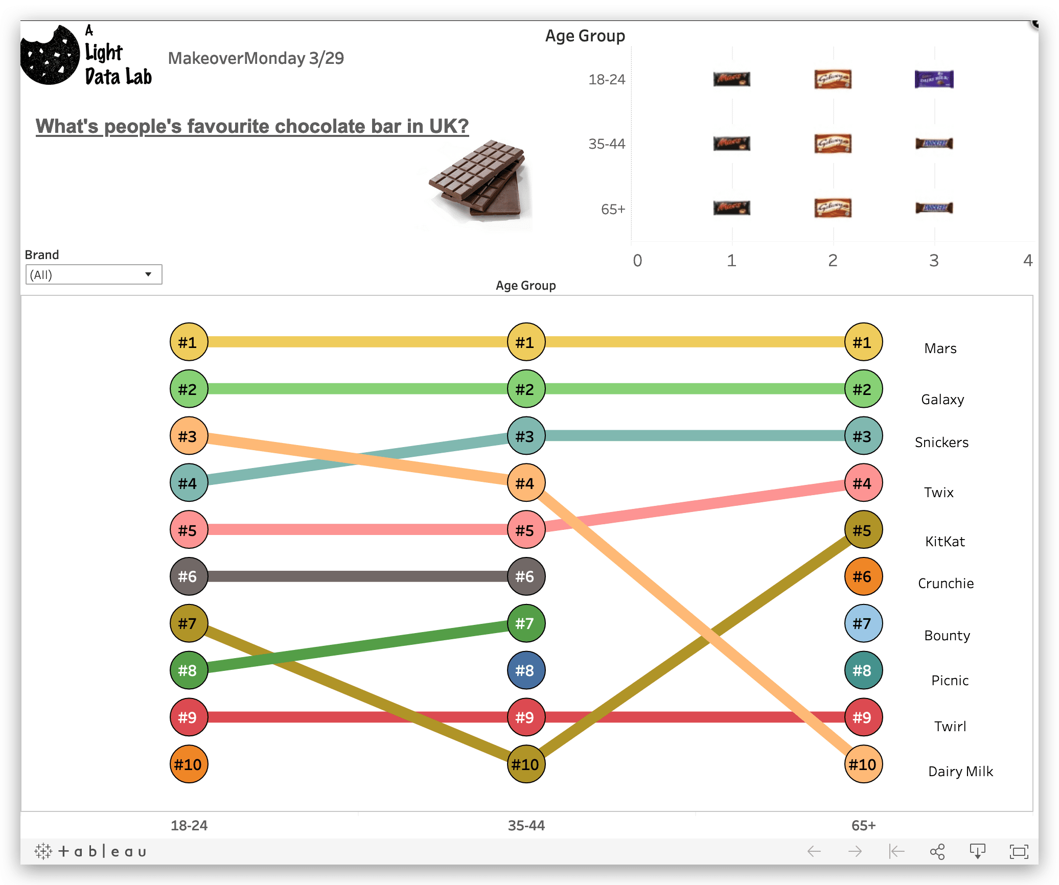
Top Chocolate Bars in UK - Data Visualization with Tableau(MoM 3/29)

Data visulizaiton would always be fun if you have some interesting data. I learned and gained the inspiration from my friend Yu Dong. Every week, This website would share a new social data and the article related to it, and would ask people to replicate the project in data visualization tools. I found it pretty interesting so I decided to give it a try this weekend! Hope I can make it into a tradation for each week. :)

I also took reference from the bump chart and custom shapes.

The Tableau Dashboard is here

JEwNSS

Where did Minnesotans Fly? - Flight Data Analysis

Introduction

Got TBs of data? Tired of waiting for Tableau's response?

You can save 70% of your waiting time utilizing the power of Cloud! In this post, I’ll show you how I used Google’s Big Data platform “BigQuery” together with Tableau for Data Analysis and Visualization.

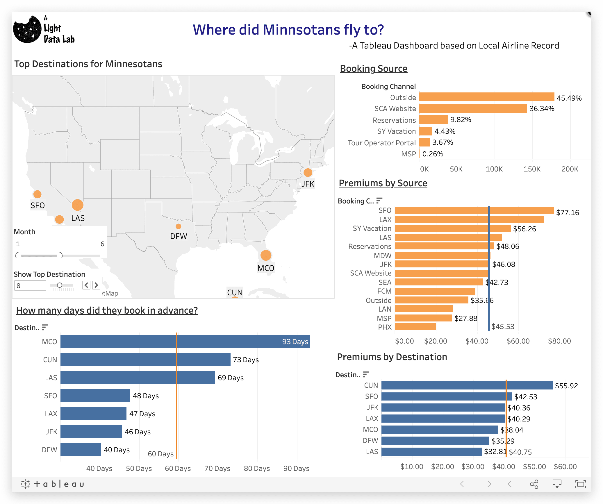
Here is the Tableau Dashboard

vms7oC

What is BigQuery?

BigQuery is Google’s solution for Big Data Analysis. Compared with Hadoop, BigQuery can do better in real-time querying and data analysis. For other competitors like Apache Spark, Google’s Bigquery offers easier setup and more flexible billing plan. Also, embedded with Google’s IAM system, access control would be much easier compared with Apache’s ZooKeeper.

Data Source

The data is from Minnesota local airline travel records of 2013 and 2014, in CSV format with 800+ MB size.
Data should first be uploaded to Google Cloud Storage, or other Storage Service like S3. After that, heads to the Bigquery Control Panel, and adds the file as your data source. Bigquery would automatically try to detect the schema. But you can also define it by yourself.

Drawing

After adding the data to your BigQuery Data source, you can either wrote SQL queries through BigQuery’s platform, or connect your Tableau to Bigquery by authenticating through the start page.

Why BigQuery+Tableau

Drawing
We all have seen this icon pretty often.

We all know Tableau is not very good at working with huge dataset, especially calculations. Now with Bigquery, Tableau would send the calculation request in SQL query to the cloud and get result instantly. I tried myself and it cuts my waiting time from 10+ seconds to less than 1 second. Bigquery also enables people to share the same dataset without actually owning the data. So that your workbook could be live and mobile.

What do we learn about Minnesotan’s data

1.Time

Minnesota people fly for different purposes on different seasons. During winter, people fly more for vacations and “warmer places”, including Las Vagas, Orlando or Cancun (Especially during the days when the temperature drops below 0). For other seasons, customers fly mainly for business purposes. Destinations include San Francisco, Los Angeles and New York.

2. Advanced Booking

It follows the similar trend with the purposes. For vocational travel, people tend to plan well ahead. You could even see people book over 3 months ahead for a trip to Orlando. For the business trip, there would be less planning for ticket booking.

3. Booking Source

Outside booking took over 40% of all the bookings. But we also noticed that, for vacation travels, customers also utilize “Airline Vacation Bundle“ and “Reservations“ more. Because a large proportion of these customers are older generations. For business travel, we would see more in “Airline Website”, as the average age for customers is younger.

4.Airline Membership

For different destinations, the proportion of Airline Membership among passengers is also different. People who flys for business travel are more likely to become a member of the Airline Club, as we see higher membership percentage for SFO, LAX and DFW.

5.Premiums for the Airline

We would define the premium as the difference between ticket base price and what the passenger actual paid, which includes luggage fee, onboard purchase, taxes and other services. It’s not surprising to see ‘Vacation Package‘ and ‘Reservation‘ offers good premiums for the Airline. But we also saw “Airline Website“ offers up-to-average premium. For Outside booking, the premium would be less than average. Flight to Cancun also offers higher premium, compared with other Business travels.

Business Recommendations

1.Targeted Marketing Plan

We see that for different age group, travel patterns are different. We could run cluster segment based on their age, frequent travel destination and travel time.

For the elder generation, they would usually go for vacation trip during winter, and prefer reservations and vacation bundles. For younger ones, they go more for business travel, and are more interested in mileage and points.

The main marketing channel is though Mail ads. For elderly, the ads would be special coupons for airplane-hotel bundles, or booklets for vacation choices and casinos recommendations. For the younger generation, membership benefits abd prequalified card offers would be a good strategy.

Also, for these customers, Email promotion could also be useful, where we could use AB testing to dive deeper into their preferences and provide personalized offers.

2.Adjust price policy

Different destinations would have different ticket booking times. For vacation places, trips are planned and tickets would be booked ahead of time.So airlines could use price discrimination to pose higher price variation during peak times and lower the variation in the flow of the time. For business travels, the price would be lower for planned passengers, and more volatile when it comes close to the travel date.

3.Promote its own booking system

We also found that the Airline’s website provided higher premium compared with outside booking. Airline website is also a good channel for the company to advertise its hotel bundle and travel plans. So airline should put more effort on promoting its own booking system, including providing exclusive offers, online newsletter and introducing paid channels.

What could be done in the future?

We could also use this data for predictive modeling to help the airline save cost and avoid the risk of over-selling. Or use clustering model and association rules for personalized promotions and bundles. Spark ML would be your good friend for Big Data modeling, and both Google Dataproc and Amazon EMR could be used for setup.

Know where has Google tracked you - Location History Visualization App
© Ted Goff

After the scandal of Cambridge Analytica, I start to wonder: How much have these Internet companies known about me?

There are some methods you can find some of the data they have collected, including Google Takeout and Facebook. Some people already had some surprising finding that Facebook even recorded their call list.

One of the most sensitive data is the location history. Basically they know every place you have been, and even the speed you moved sometimes. So I wrote a small Shiny App to visualize your Google Location History. For myself, although I expected Google may collected some thing interesting as I used to be an Android User, but I don’t expect to be that much! My dorm, my home, even the spot I hanged out with someone!

My Loc History
Wow, you really know me a lot Mr.Google.

If you want to try out and be surprised. Here is the app.

Privacy: We are not going to be another Cambridge Analytica! Your data would be uploaded to RShiny's cache. It will only be used for the purpose of rendering this visualisation. ANY FILE would be permently wiped once you closed the app. You are also welcomed to audit the code at A Light Data Lab Github Page

R Shiny App: NLP Next Word Prediction

This article would show you how I build a Rshiny app for Natural Language Processing and Prediction.

Prediction

1.Data Processing

  • First, all non-English characters are removed; numbers, punctuation, whitespace was also removed. All text is also changed to lowercase.
  • Profane words are also removed. The project used Carnegie Mellon University’s resource: Offensive/Profane Word List.

2.Prediction Algorithm

  • Tokenization: used for finding the frequency of five types of n-gram: unigrams (single words), bigrams (two word phrases), trigrams (three words), quadgrams (four word) and quintgrams (five words).
  • N-grams: indicate which words appear together in the text. (The higher the frequency of a certain n-gram, the more likely it is to be found in the corpus.)
  • The predictive algorithm uses the n-gram frequency to suggest/ predict the next word based on the users input. The model checks the phrase length and starts with the quintgram, then moves onto the quadgram and so on. The model is a version of a ‘back-off’ model.

3.Actual R-shiny App

This is the R-Shiny app based on N-gram Human Language Processing.

Test Image

Welcome!

Welcome!

Welcome to my personal website! I plan to update this site regularly throughout my time as a master student at University of Minnesota, where I am focusing on data analysis and machine learning models. I hope to not only post about my progress, but to also explore other ideas for data analysis and make them more accessible. Look for the website to pick up more content in the upcoming months and years.